
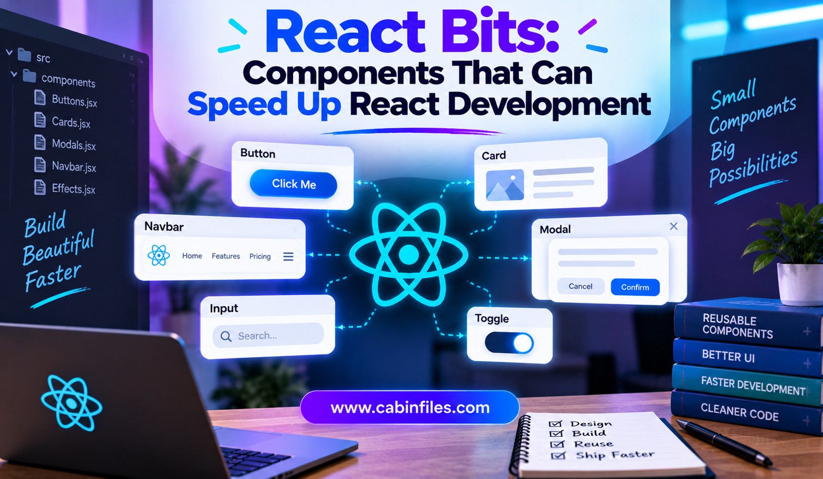
Building a modern React website can be exciting, but creating every interface element from scratch can quickly become time-consuming. Developers often need to spend hours working on buttons, cards, navigation menus, animations, galleries, text effects, backgrounds, and other visual details before they can focus on the actual purpose of the application.
This is where React Bits can make the development process easier. React Bits is a library of animated React components designed to help developers create more engaging interfaces without having to build every visual effect from the ground up. Its library includes components for text, animations, UI elements, cards, backgrounds, galleries, cursor effects, and more.
For developers who want attractive interfaces while keeping development practical, React Bits can provide a useful starting point.
What Is React Bits?
React Bits is a collection of animated components for React projects. Instead of requiring developers to design and code every visual interaction themselves, the library provides ready-to-use components that can be adapted to different projects.
The current library covers several categories, including text animations, animated interactions, UI components, cards, galleries, cursor effects, and visual backgrounds. Examples include animated lists, accordions, carousels, card effects, circular galleries, sliders, navigation elements, and various text animations.
The goal is not simply to provide generic interface elements. Many components are designed to give websites a more distinctive visual identity.
Why Ready-Made React Components Matter
Creating a website involves much more than writing basic HTML and CSS.
A developer may need to implement a responsive navigation menu, animated hero section, interactive card, image gallery, loading animation, or custom text effect. Each feature can require design decisions, JavaScript logic, responsive styling, and testing.
When these elements already exist as reusable components, developers can start from a working foundation.
This can shorten the time between an idea and a functioning interface.
Instead of spending an afternoon creating an animation from zero, a developer can select an appropriate React Bits component, install or copy it into the project, customize its properties, and move on to the next part of the application.
A Large Selection of Visual Components
One of React Bits’ biggest advantages is the range of components available.
Its current catalog includes categories such as text animations, animations, components, and backgrounds. Developers can find effects such as rotating text, scrambled text, glitch text, gradient text, scroll-based animations, magnetic interactions, animated borders, galleries, menus, cards, and different visual backgrounds.
This variety makes React Bits useful for many types of projects.
A startup landing page might use animated text and a dynamic hero background. A portfolio could benefit from interactive cards and image galleries. An AI application could use animated interface elements to make dashboards and product screens feel more polished.
The same library can therefore support different design directions without forcing developers into one fixed visual style.
Animated Interfaces Without Starting From Scratch
Animation can make a website feel more responsive and modern, but implementing good animation requires more than simply adding movement.
Timing, transitions, responsiveness, performance, and user interaction all matter.
React Bits provides many animation-focused components that developers can integrate into their applications. The library includes effects such as magnetic interactions, cursor effects, scroll reveals, image trails, particle effects, and animated borders.
This gives developers an opportunity to experiment with interaction design without having to develop every animation system independently.
The result can be a more engaging user experience while reducing some of the implementation work.
Useful for Landing Pages
React Bits can be particularly useful for marketing websites and landing pages.
A landing page often needs a strong visual first impression. Animated headlines, interactive cards, dynamic backgrounds, and smooth transitions can help differentiate a page from a basic template.
Developers can combine multiple React Bits components to build sections such as:
- Hero areas
- Feature sections
- Pricing interfaces
- Product showcases
- Image galleries
- Navigation menus
- Interactive cards
- Call-to-action sections
The component-based approach means developers can select only the elements that fit their design rather than adopting an entire website template.
React Bits Pro Expands the Component Library
In addition to the broader React Bits component collection, React Bits Pro currently offers a larger collection of animated components, page blocks, application UI blocks, templates, and an Agent Kit.
The Pro documentation currently lists 134 animated components, 238 marketing blocks, 300 application UI blocks, and 11 complete templates.
The application UI collection is particularly relevant for developers building actual products rather than only promotional websites. It includes interfaces such as dashboards, data tables, settings screens, navigation structures, and AI-related surfaces.
This makes the ecosystem broader than a simple collection of decorative animations.
Components Can Be Customized
Ready-made components are most useful when developers can adapt them to their own projects.
React Bits Pro emphasizes typed components and theming capabilities, including controls for aspects such as accent colors, fonts, and border radius across application UI blocks.
This matters because developers rarely want every project to look identical.
A component can serve as the foundation while developers modify its typography, spacing, colors, content, and behavior to fit the application’s visual language.
The result is faster development without necessarily sacrificing customization.
Code Lives in the Project
Another important aspect of React Bits Pro is its approach to delivering source code.
Its documentation states that the code is copied into the developer’s repository rather than remaining inside a dependency package. This means developers can inspect and modify the implementation directly.
For developers, this can be valuable when a component needs significant customization.
Instead of treating the component as a black box, the developer can examine the source, understand how it works, and adjust it according to project requirements.
This also provides greater control over the final application.
Tailwind CSS and Vanilla CSS Options
React Bits supports different styling approaches.
The current documentation lists animated components in Tailwind CSS and vanilla CSS variants.
This flexibility can make the library more practical for different React projects.
Developers already using Tailwind can integrate components into an existing utility-based styling workflow, while developers who prefer conventional CSS can use the appropriate alternative.
Choosing a component library that fits the existing technology stack can reduce the amount of additional restructuring required.
React Bits and AI-Assisted Development
AI coding assistants are becoming increasingly common, and component libraries can work particularly well alongside them.
React Bits Pro includes an Agent Kit containing design skills, prompts, and page-building recipes intended to help AI agents assemble pages from the available library.
The documentation says developers can provide an AI coding agent with a design skill and instructions describing which blocks to combine.
This creates an interesting workflow:
Developer idea → AI agent → React Bits components → customized page → developer review
Instead of asking an AI assistant to invent an entire interface from scratch, developers can give it a structured collection of existing components.
That can make AI-generated interfaces more consistent and easier to refine.
Creative Tools for Faster Design Experiments
React Bits also provides creative tools that can support the design process.
Its current tools include Background Studio, Shape Magic, and Texture Lab. These utilities allow developers and designers to experiment with animated backgrounds, shapes, image effects, and exportable assets.
This can be helpful during early design exploration.
Rather than searching for a separate tool for every visual experiment, developers can use resources from the same ecosystem to explore different interface ideas.
Performance Still Matters
A visually impressive component is not automatically appropriate for every website.
Developers should consider page performance, accessibility, mobile behavior, browser compatibility, and the overall number of animations used.
A page containing too many heavy effects can become distracting or negatively affect performance, especially on lower-powered devices.
The best approach is to use animation with a purpose.
For example, a subtle hover effect may improve interaction feedback, while an elaborate background animation might be appropriate for a creative portfolio but unnecessary for a business dashboard.
React Bits provides the building blocks, but developers still need to make good design and engineering decisions.
React Bits vs Building Components From Scratch
Building everything manually provides complete control, but it can take considerably more development time.
React Bits offers another approach: begin with a functioning component and customize it.
This can be particularly useful when the visual behavior is relatively common but implementing it would require significant effort.
The developer’s time can then shift toward application logic, accessibility, business requirements, testing, and product experience rather than repeatedly recreating common UI patterns.
Who Can Benefit From React Bits?
React Bits can be useful for several types of developers.
Frontend developers can use it to speed up UI development and experiment with interaction effects.
Startup teams can use ready-made components to build polished product pages without creating every visual element from scratch.
Freelancers and agencies can use reusable components to accelerate client projects while customizing the final design for each brand.
Portfolio developers can use animations and interactive components to make personal websites more visually distinctive.
It can also be useful for developers experimenting with AI-assisted development because structured component libraries give AI coding tools concrete building blocks to work with.
Final Thoughts
React Bits offers developers a practical way to speed up React interface development by providing reusable animated components and visual building blocks.
Its extensive collection includes text effects, animations, cards, galleries, menus, backgrounds, cursor interactions, and other interface elements. React Bits Pro expands this approach further with marketing blocks, application UI, templates, and tools designed to work with AI coding agents.
The biggest benefit is not simply having access to attractive components. It is the ability to start with working building blocks instead of starting from a blank file.
For developers, that can mean less time recreating common interface effects and more time focusing on functionality, usability, and product development.
As React development increasingly combines reusable components, animation libraries, and AI coding assistants, tools such as React Bits can help make the path from an idea to a polished interface considerably faster.